Fine Art Search

Custom Search

Tuesday, June 28, 2011

Abstract Design In Realist Painting


Wednesday, June 22, 2011

Creative License


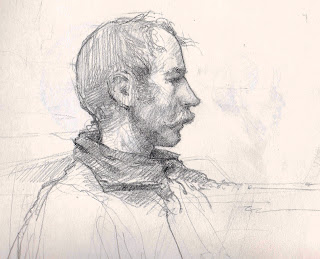
I've posted 2 drawings of the same model from the same pose. Both were demos from my class at DuCret School of Art in Plainfield New Jersey. I use the term "Demo" loosely, I didn't stop the class to do the demo, I often times do these in one on one instruction from the model. I try to find what that particular student needs to see at that moment and just go with it. Sometimes that means doing a little demo, other times it will mean a walk to the library to look at some work by other artists that illustrate the concept we are discussing.
The model who posed for the class the day I did these sketches reminded me of characters I've seen in Western movies. Something about his facial structure and the mustache put me in that mindset. One drawing shows our model Jim pretty much as he appears, the other is Jim reimagined as a character from a western. 
 I used "artistic license" to change just a bit of what I was seeing to convey a narrative element. 

Monday, June 20, 2011

Graying Colors in Your Painting

Too much vibrandt color in a painting can draw attention away from the 
subject of your painting.
In "Guitar Player, Venice" I limited the use of strong vibrant colors to some key areas in the painting to help with the flow of the composition. With the exception of the red flowers in the hanging basket to the left, the pink shirt on the figure seated to the right and the orange glow of the shop window I have grayed all the other colors by mixing in a bit of the complimentary color in. 
I also like to counterchange a dark against a light within the composition. The guitar player is predominately dark played against the light of the distant building and slate walkway. The hanging lantern is set against the dark value of the building. 

Saturday, June 18, 2011

Bethesda Fountain, Central Park

 The painting I have posted is a studio piece from a few years ago and the original was sold shortly after it was completed. The placement of the vending cart on the left anchors the composition on that side of the design. The diagonal lines on the terrace offer a lead in to the pictorial space and the grouping of figures on the right directs your gaze back towards the center of the composition and the angel of the waters sculpture. 
It's basically a design scheme built upon a triangle.
Bethesda Fountain is one of the many gems of Central Park. The tile ceiling of the terrace arcade is made up of almost 16 thousand tiles and was fully restored and reopened 4 years ago. During a recent painting trip that was part of a plein air painting event I painted a view of the fountain from underneath the terrace. Fellow artists Garin Baker and Ken Dewaard were painting there as well, you can see their paintings by clicking the links below.
http://kendewaard.blogspot.com/
http://www.jcas.org/
While painting we were treated to an incredible mini concert featuring interpretations of classical music with flawless four part harmony and a bass cello. The park has designated the area a quite zone and is trying to crack down on the public performances, that would be a shame. 

Friday, June 17, 2011

Contrasting Textures while Maintaining Unity

In "Window Watchers, Siena" I was drawn to the aged facade of the building and the gestures of the figures in the window.
In building the painting I focused on laying the paint on and creating a surface quality that conveyed the tactile quality of the various elements. The brick, shutters, window frame, drapes and figures all vary in paint application while maintaining unity.
In terms of color scheme I played the blue grays off the orange-reds of the brick. I also limited the highest contrast to the figures, the focal point of the painting. The strong dark triangle created by the space between the drapes behind the figures anchor the focal point and draw the eye in.

Thursday, June 16, 2011

Tuesday Night Open Studio

DuCret School of Art in Plainfield runs an open studio on tuesday evenings from 6-9pm.
http://ducretopenstudio.blogspot.com/
During the school year I teach drawing and painting from the model from 9am-noon and 1-4pm. I have an open door policy with professional artist friends of mine to drop in when they want to on tuesdays to draw and paint. For my friends the access to a free model was all the incentive they needed, 6 hours of work from life...what more could you want. The benefit for the students is to be able to look over the shoulders of these talented, seasoned professionals and see their work develop from start to finish.
The first artist to take up the offer was Dorian Vallejo, an incredible artist with an enormous enthusiasm for working from life. A friend of Dorian's, Richard Scarpa, a talented portrait painter, became a regular soon after.
Garin Baker, a great painter, draftsman and muralist, began dropping in on tuesday. While all the artists who drop in are there to work from life they give freely of their knowledge and training to the students.
While cleaning our brushes after a tuesday afternoon session we saw a DuCret student Dwayne Watson setting up a pose with a friend who volunteered to model for him in between classes. Dorian and I stopped washing our brushes and joined Dwayne and a couple of other students including Tomas Hurtado to work from the pose they set up for the next 2 hours. What's better than 6 hours of working from life? Answer: 8 hours of working from life.
The open studio grew from those early sessions. It has evolved into an open studio session with a costumed model accompanied by live music from a talented meet-up group. The school has the right feel for art, old easels, taborets, the smell of paint and turpentine, it's not antiseptic in the way some other "art centers" can be. If you are in the area join us on tuesday, contact the school for info.
Here's the website: www.ducret.edu
The "Open Studio" is a pay as you go per session. $15 for visitors, $10 for students of the school.
The drawing of "Amber Armed" is from this past tuesdays session. Elizabeth Amber, our model, went with a pulp fiction themed costume and pose, watergun and all. I arrived late wishing I brought my paints and worked on this drawing.

Wednesday, June 15, 2011

Flattening Spatial Depth

There are times when I intentionally like to flatten spatial depth in my paintings. Some subjects present themselves to me as a very strong graphic design and suppressing the atmospheric perspective, (the lessoning of contrast and cooling of form as they recede in space), accentuates the graphic quality of the composition.
In "Under the Boardwalk, Coney Island" the darks of the area underneath the boardwalk are repeated in the handling of the roller-coaster, as a result the spacial depth is diminished and the elements in the composition read as a unit silhouetted by the sky.

Tuesday, June 14, 2011

Plein Air Painting

 Here are 3 paintings from a plein air painting event I participated in Cranford New Jersey. We have a wonderful non-profit arts organization in Cranford, the Jersey Central Arts Studios, headed by an extremely dedicated board of directors who worked tirelessly through the course of the year planning this event. With limited resources and a support staff of volunteers they were able to stage a top tier event.
The talent represented in this show was incredible. We were fortunate to have a number of the finest plein air painters in the country  participate and produce incredible works of art under some difficult weather conditions at venues they have never painted before.
Visit the JCAS website and click on the links of the participating artists and you will get a sense of the depth of talent featured. Become a fan of the JCAS on facebook to keep abreast of the events and classes they sponsor.
Visit the organization's website to find out more about their mission.
Here's the link: http://www.jcas.org/
Most of the artist's have blogs and links to galleries that handle their work.
The approach I took in my paintings were as varied as the
subjects I painted. "Twilight Rate" offered an opportunity to capture the light quality of late afternoon before sunset and actual Twilight Hour. The title refers to the discount greens fees for late afternoon golfers. The light had a pink quality as it approached the horizon. I painted thin and kept the brushwork simple. I left the trees as one mass with subtle shifts in color temperature to suggest varying sizes and distances in the stand of trees.
"Bethesda Fountain" is in Central Park and was a popular subject of American Artists around the turn of the 19th century. I felt the subject called for broken brushwork favored by the impressionist painters. Central Park is a great place and full of activity. I decided to indicate one figure seated at the fountain to keep the focus on the angel of the waters sculpture.
"Antiques" is more of a still life painting than a plein air work.
As the light changed the window reflected the setting surrounding the shops which I chose to ignore. I find in a situation like this you can shift your focus to the objects behind the glass and I didn't feel reflections would add to the painting. The clutter of the objects in the shop window required more resolved handling for them to read properly,
These paintings are all 8" X 10" and are available through my studio. Click on the images for a larger view.
Visit http://www.casalefineart.com/ for contact information and to be placed on an email list.

Monday, June 13, 2011

Individual Expression

 My favorite drawings have an interplay of line and tone.
When I think of draftsman that I admire there is that common thread of tonal passages balanced or supported by contour line in their work.

The list is long and varied, Michelangelo, Leonardo DaVinci, Rubens, Rembrandt, Ingres and Sargent to name a few.
The list also includes contemporary fine artists, illustrators and comic book artists.
Their work is easily recognizable and displays talent, vision and individual tendencies.

I am an advocate of building a skill set to enable an artist to create images that aren't hampered by poor handling.

There are times that extensive training in one approach, one way of seeing things becomes a hinderence to personal expression in an artist's work. The method and technique become the subject and content of the work and while the results can be visually impressive it becomes difficult to distinguish one person's work from another.

The art world is rich with diversity, individual expression and interpretation, if we were all playing the same tune it would be a pretty boring concert.

I think it is important to hone your craft but it is of equal importance to know what your natural traits and tendencies are and retain some evidence if individuality in your work, don't give it up so easily it may be difficult to find again. 

Monday, June 6, 2011

Emerging from the Page

I came across this drawing while straightening out my flat files. It is a life drawing from the class I teach at DuCret School of Art in Plainfield NJ.
I leave alot of drawings at this stage out of necessity, I usually only sneak in a little work on my own drawing for one sitting (15-20minutes), the rest of the time I work the room and instruct one on one.
I like the drawings at this stage because there is evidence of the process, the drawings tend to be a bit more caligraphic early on and have a feeling of being part of the page in some areas and emerging from it in other areas.

Color Saturation

Thought I'd post these 2 watercolors to illustrate different approaches to the overall handling of color.
In "On the Grand Canal" I chose a vantage point that silhouetted the building in the foreground, gondolas and figures against the light reflecting off the canal. It offered an opportunity to use more subdued color choices and think more tonally.
In "Chiesa Dei Gesuati, Venice" the direction of the light source created a much more saturated color scheme. I liked echoing the red of the building, church roof and the top of the well.
In both paintings I built the image around a strong simple design primarily dividing the pictorial space by employing a triangle as the shape that dominated the flow and placement of forms.
You can trace out a triangle on it's side in "On The Grand Canal" by following the pattern of the gondolas from lower left to right and then back again.
In "Chiesa Dei Gesuati" the one point perspective creates a strong pattern of triangles.

Saturday, June 4, 2011

Watercolors on Plate Finish Bristol

Irwin Greenberg first introduced me to the technique of developing watercolor paintings on plate finish bristol. Watercolors react differently on this surface than on traditional watercolor paper. The color dries relatively flat in this technique but it allows the ability to rework the image by rewetting a passage and lifting out, blotting or even wiping out whole areas to redevelope.
Two of the images were done from life in the class I teach at DuCret School of Art in Plainfield NJ.
The other image is a studio painting based on a very loose sketch with color notes and reference taken on site.
I've also posted one of Greenberg's beautiful watercolors.


Burton Silverman is a master of this approach and there is a link to his book "Breaking the Rules of Watercolor" below.

Friday, June 3, 2011

Repeating Shapes

I like to develop images using a number of compositional devices.

There are subjects that offer an opportunity to repeat shapes to unify the composition.

"In the Shadows" is built upon a series of rectangles as a design principle.

The single figure is the focal point and its' placement in the corridor frames it twice, once in the entrance and again counterchanged by the opening to the inner courtyard.

The one point perspective places the viewer at a specific vantage point and the limited palette reinforces the use of repeating shapes as the dominant compositional device.


Thursday, June 2, 2011

Color Harmony in Paintings

I like taking complimentary colors and building an image around a color scheme.
When painting "In With the Tide" I planned the color around a specific set of warm and cool colors. The warms consisted of yellow ochres and orange shades complimented by blues and violets.
It helps simplify the mixing if you keep the piles of colors in areas relative to the arrangement on your palette. I arrange my colors from warm to cool, starting with the warms on my right.
My lighter values and warms tend to be on the right of my mixing area nearest my white paint, middle values in the middle of the mixing area and cools and darks to the left.
I also added a touch of warm green in the water and echoed the same color in the distant shrubs. The strong diagonal and change in scale of forms create the spatial depth while the color notes of the foreground and distance hit some of the same notes.