In "Side Street in Rome" I approached the painting with a design that conveyed a sense of light and shadow. The sense of contrast is kept fairly subtle, the painting stays predominately in a middle value range. I massed in the large pattern first to establish the design and to remind myself to stay within a set value range for the lights and another for the areas of the image that were in shadow and indirect light.
I tend to mix on my palette with value in mind. The middle of my palette will have the puddles of color that are in the mid value range, the darks are mixed to the left and the lights to the right. The value puddles mimic the arrangement of colors on my palette. My palette is arranged from warm to cool from right to left and my white is on the right hand side, I'm right handed and the placement of white on the right makes sense to me. After years of working this way it has become second nature.
To get my point across when teaching students about value I compare light and shadow to Mafia families, the lights are the Colombos and the shadows are the Gambinos, if everybody stays where they belong in the picture nobody has to get rubbed out. So if you are painting an area in your image that is part of the shadow, not being lit directly, you load your brush from the middle and dark puddles on your palette.
I don't premix a range of values and colors, I can see it is a helpful method and it does help yield consistent results and the consistency is part of what I don't like about paintings of the premixed palette approach. There tend to be the same color and value choices regardless of the image being depicted and often times the darks never seem rich enough.
There is also a tendency to use the premixed color because the value corresponds to what is seen even if the color doesn't. There is a lot to be learned from various methods and systems and control is a great asset, until it controls an artist's willingness to take chances and respond to what a particular painting calls for. Method and system driven art tend to be safe choices offering few surprises along the way, there's a bit of a guaranteed look. There are key principles in approaching a painting or drawing, training and developing a reliable set of skills and working knowledge is crucial, just don't let the technical aspect of creating hamper your range of choices.
A work of art is the trace of a magnificent struggle. (Robert Henri)
Paul Casale Fine Art
Daily Paintings, Discussion Of Studio Work, News On Workshops, Classes, Events And Shows
Fine Art Search

Custom Search
Saturday, July 23, 2011
Wednesday, July 6, 2011
Shared Visions
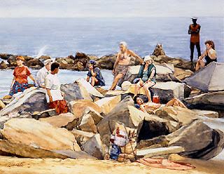 From my early teens I've been heading to Coney Island. Sometimes just to spend the day at the beach and other times to paint or sketch. As a young art student some of the Coney Island regulars would approach me as I was working to ask my if I knew the older guy who painted here alot. At the time I didn't know who it was.
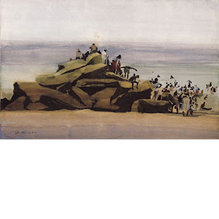
  A number of years later I was at the Forum gallery to see an exhibition of David Levine's work, after seeing his beautiful watercolors of Coney Island I realized he was the artist that the Coney regulars were talking about. Seeing what he did with a subject that was near and dear to me was and still is inspiring. The watercolor at the bottom right, "Rock Fleas" is an example of Levine's work.
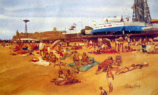
The watercolor in the center is by Irwin Greenberg, a great artist and teacher. I was fortunate to have Greenberg as a teacher and to have him as my mentor as a teacher at the High School of Art and Design in New York City.
The top watercolor is one of my paintings.
 I structured the composition to form a z pattern. In the narrative I liked having this grouping of people clustered together but not interacting with one another, they are alone in their thoughts.
 I think it's important to find other artists who have a shared vision of a place. I never met David Levine but I know and love his work and it has been an influence on how I see one of my favorite subjects.
Some artists feel they have to shy away from the influence of other artists,
I couldn't disagree more, I think it can be an incredible resource.
Tuesday, June 28, 2011
Abstract Design In Realist Painting
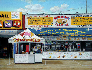
I think when the term "realism" is applied to visual art there is a tendency by viewers, critics and artists to neglect the abstract design that an image is structured upon. A good "realist" painting has all the same considerations as an abstract painting, composition, form, color, line, surface quality etc. and has the added complexity of conveying beleivable representation of light, space, form and time. When all the elements of picture making are handled skillfully the viewer may overlook all the thought that goes into composing the image, when the rendering is executed poorly it's evident to even the untrained art viewer.
It's a difficult business.
Essentially we are taking a two dimentional surface and are transforming it to convey such a complicated range of elements. Depth, perspective, structure, form, color, light, shadow, hard and soft edges, texture, time of day, personality, mood, a sense of time and place, maybe a narrative. Mix in with that the added response that the person viewing a painting brings to the image, their own memories and experiences and you have a great number of things to consider.
In my painting "Italian Ices" the composition plays a number of square and rectangular shapes off each other, almost like a Mondrian handled through a filter of realist artist. The pop-up shade tent of the Italian Ice stand creates a triangular shape that I echo girl's posture and repeat in array of wires in the upper right. The signage gave me the chance to repeat the use of a number of colors throughout the composition.
I was interested in the posture of the girl working the Italian Ice stand on the boardwalk at Coney Island in Brooklyn, New York. The scene also offered the opportunity to juxtapose the figure against the busy signage of the boardwalk. The couple in the background serves as a secondary focal point and draws the viewers eye and directs it through all the items in the glass counter and behind the counter. Although every item is taken to a high degree of rendering, the objects in the interior space have a more subdued handling of color, placing the figures in that space attracts attention to that area of the painting.
I chose pastel as the medium for this painting, it was challenging to create this picture in pastel but I think the image called for it.
Wednesday, June 22, 2011
Creative License
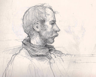
I've posted 2 drawings of the same model from the same pose. Both were demos from my class at DuCret School of Art in Plainfield New Jersey. I use the term "Demo" loosely, I didn't stop the class to do the demo, I often times do these in one on one instruction from the model. I try to find what that particular student needs to see at that moment and just go with it. Sometimes that means doing a little demo, other times it will mean a walk to the library to look at some work by other artists that illustrate the concept we are discussing.
The model who posed for the class the day I did these sketches reminded me of characters I've seen in Western movies. Something about his facial structure and the mustache put me in that mindset. One drawing shows our model Jim pretty much as he appears, the other is Jim reimagined as a character from a western.
I used "artistic license" to change just a bit of what I was seeing to convey a narrative element.
Monday, June 20, 2011
Graying Colors in Your Painting
subject of your painting.
In "Guitar Player, Venice" I limited the use of strong vibrant colors to some key areas in the painting to help with the flow of the composition. With the exception of the red flowers in the hanging basket to the left, the pink shirt on the figure seated to the right and the orange glow of the shop window I have grayed all the other colors by mixing in a bit of the complimentary color in.
I also like to counterchange a dark against a light within the composition. The guitar player is predominately dark played against the light of the distant building and slate walkway. The hanging lantern is set against the dark value of the building.
Saturday, June 18, 2011
Bethesda Fountain, Central Park
The painting I have posted is a studio piece from a few years ago and the original was sold shortly after it was completed. The placement of the vending cart on the left anchors the composition on that side of the design. The diagonal lines on the terrace offer a lead in to the pictorial space and the grouping of figures on the right directs your gaze back towards the center of the composition and the angel of the waters sculpture.
It's basically a design scheme built upon a triangle.
Bethesda Fountain is one of the many gems of Central Park. The tile ceiling of the terrace arcade is made up of almost 16 thousand tiles and was fully restored and reopened 4 years ago. During a recent painting trip that was part of a plein air painting event I painted a view of the fountain from underneath the terrace. Fellow artists Garin Baker and Ken Dewaard were painting there as well, you can see their paintings by clicking the links below.
http://kendewaard.blogspot.com/
http://www.jcas.org/
While painting we were treated to an incredible mini concert featuring interpretations of classical music with flawless four part harmony and a bass cello. The park has designated the area a quite zone and is trying to crack down on the public performances, that would be a shame.
Labels:
central park,
Contemporary Realism,
oil painting
Friday, June 17, 2011
Contrasting Textures while Maintaining Unity
In "Window Watchers, Siena" I was drawn to the aged facade of the building and the gestures of the figures in the window.
In building the painting I focused on laying the paint on and creating a surface quality that conveyed the tactile quality of the various elements. The brick, shutters, window frame, drapes and figures all vary in paint application while maintaining unity.
In terms of color scheme I played the blue grays off the orange-reds of the brick. I also limited the highest contrast to the figures, the focal point of the painting. The strong dark triangle created by the space between the drapes behind the figures anchor the focal point and draw the eye in.
Labels:
Figurative Paintings,
italy,
oil painting,
Siena,
Traditional Realism
Subscribe to:
Posts (Atom)


